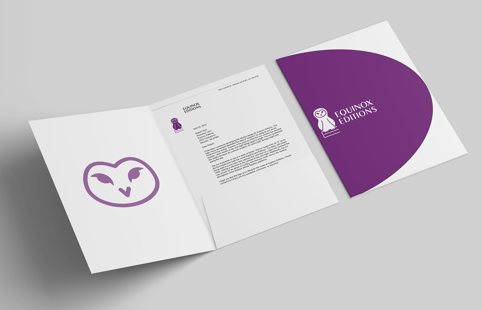
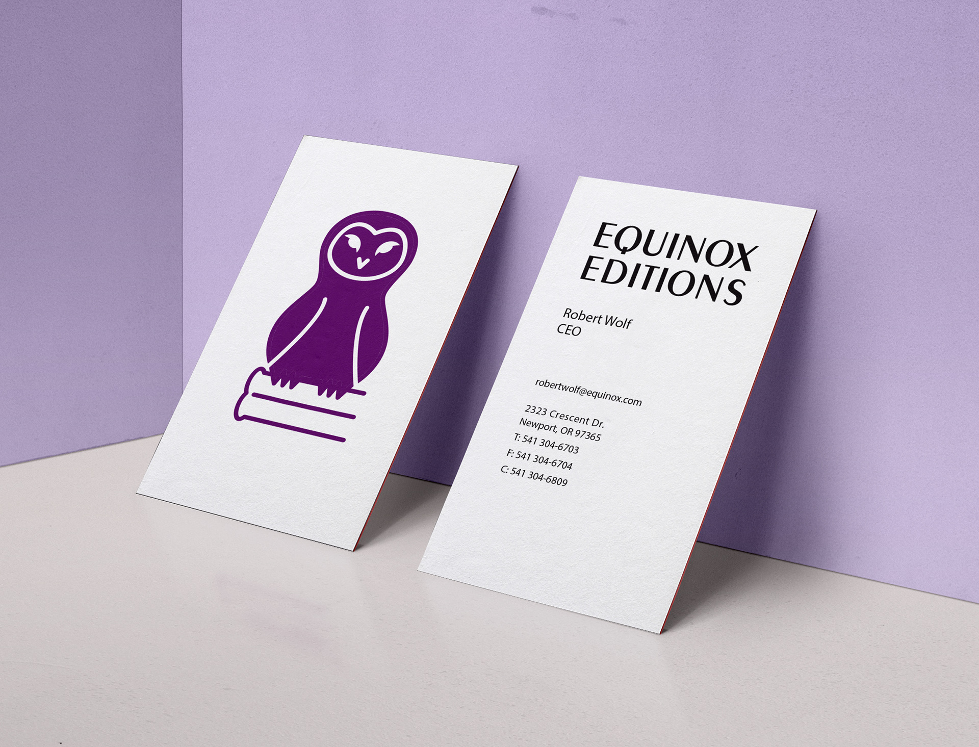
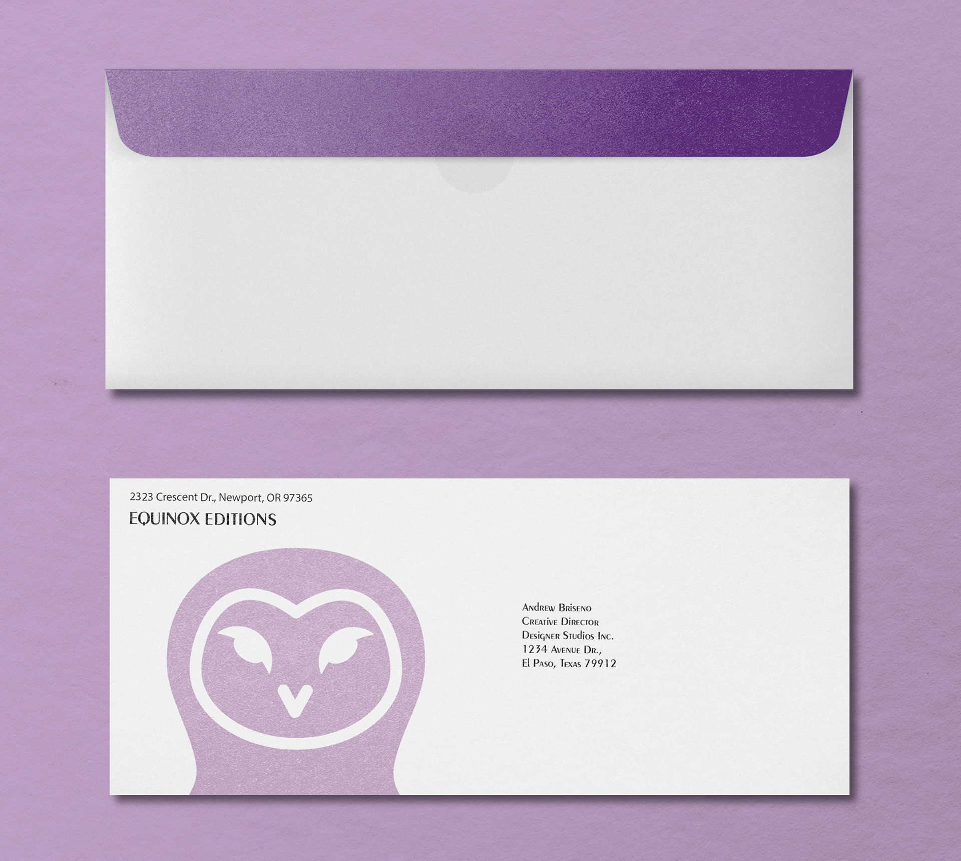
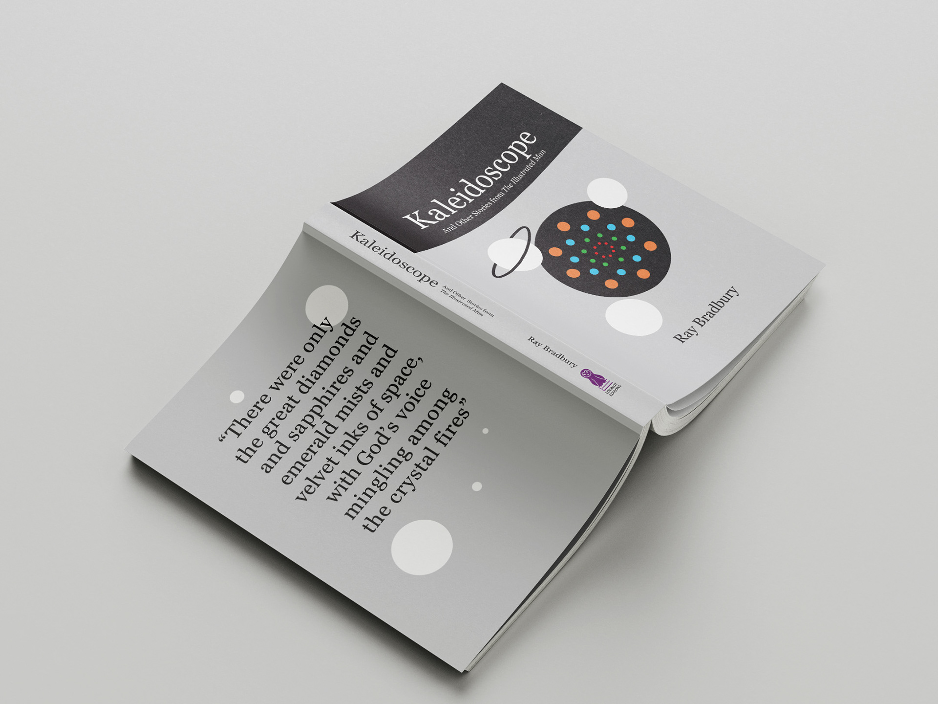
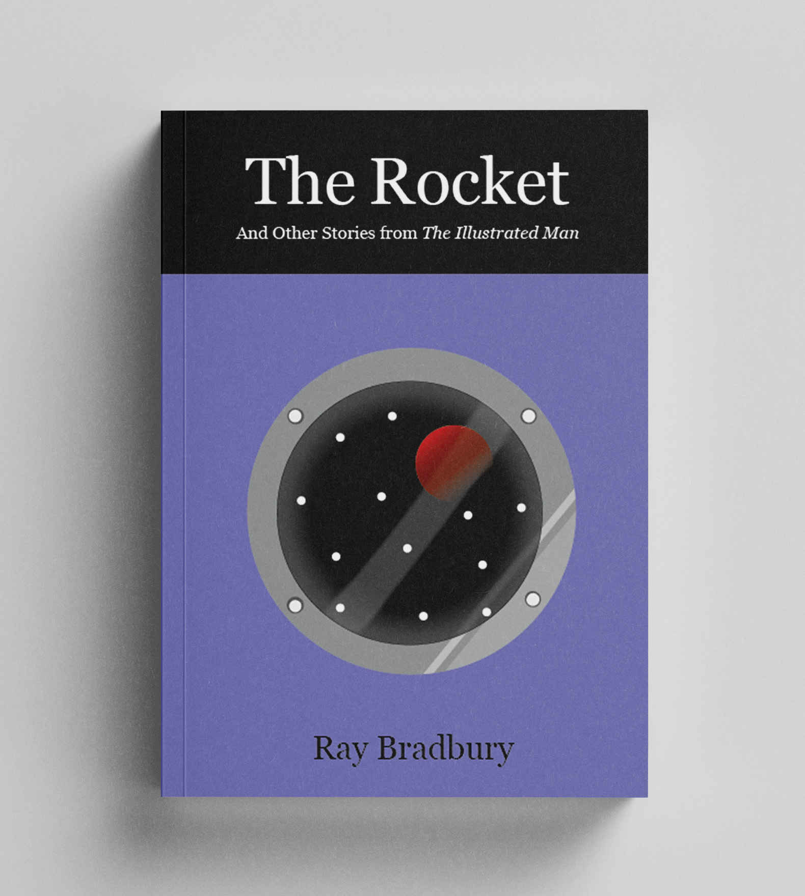
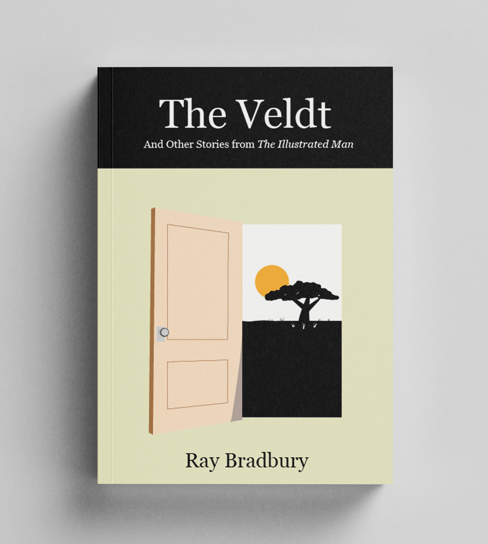
I developed this brand identity for a fictional publishing company called Equinox Editions in my Graphic Design 3 class. Focusing on the word equinox, or the moment at which the center of the visible Sun is directly above the equator, my solution was to use a nocturnal owl to represent the company. The project included developing a logo and stationery set along with three book design covers for Ray Bradbury's The Illustrated Man. 
Equinox Editions logo. An owl sitting on a stack of books with the words Equinox Editions next to it. A dark purple fills the background.
Equinox Editions stationery set. Above: Business folder shown both opened and closed with a letterhead inside the pocket. Below left: two business cards showing both front and back designs. The owl logo stands alone on the front, with contact information on the back.Below right: two envelopes, one showing the front and the other showing the back.
Book cover for the story Kaleidoscope laid flat with covers facing up. A colorful kaleidoscope at the center with planets flying out from the pattern. Bottom left: Book cover for The Rocket. The window shown looking out into space with a rocket flying by. Bottom right: book cover for The Veldt, an opened doorway revealing an African safari landscape.

You may also like

Back to Top